Time Series: Interactive Exploratory Data Analysis
Visual representation of Time Series is one of the most common forms of usage of data visualisation.
Line Graphs are used to display quantitative values over a continuous interval or time period. A Line Graph is most frequently used to show trends and analyze how the data has changed over time. Line Graphs are drawn by first plotting data points on a Cartesian coordinate grid, then connecting a line between all of these points. Typically, the y-axis has a quantitative value, while the x-axis is a timescale or a sequence of intervals. Negative values can be displayed below the x-axis. The direction of the lines on the graph works as a nice metaphor for the data: an upward slope indicates where values have increased and a downward slope indicates where values have decreased. The line’s journey across the graph can create patterns that reveal trends in a dataset.
Slope graphs are similar to line graphs, but are used to show a ‘before and after’ story of different values, based on comparing their values at different points in time. The related values are connected by slopes. It might be used to show change in food and drink prices between two years, as in this example on the right. Look at the ranking order of the values on the left to get a sense of the gaps and the clusters. Then observe the connecting lines between the related values. Which have gone up, down or stayed the same? Focus on the big picture before diving into more detailed interpretations. Even if all or no values have altered dramatically, that too could be an important finding. Sometimes colors are used to accentuate changes up or down.
Heat maps visualize data through variations in coloring. When applied to a tabular format, Heat maps are useful for cross-examining multivariate data, through placing variables in the rows and columns and coloring the cells within the table. Heat maps are good for showing variance across multiple variables, revealing any patterns, displaying whether any variables are similar to each other, and for detecting if any correlations exist in-between them. Typically, all the rows are one category (labels displayed on the left or right side) and all the columns are another category (labels displayed on the top or bottom). The individual rows and columns are divided into the subcategories, which all match up with each other in a matrix. The cells contained within the table either contain color-coded categorical data or numerical data, that is based on a color scale. The data contained within a cell is based on the relationship between the two variables in the connecting row and column.
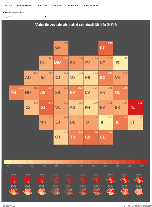
Tile maps are maps of an area using uniformly-sized shapes. The tiles may be circles, squares, hexagons, etc. Tile maps have become the standard when visualizing data where the sizing of the geographical region is unimportant. One of the major problems with a standard map is that some of the represented regions are larger in area and give the impression of more visual weight, when in fact some other regions have typically larger population density. Another disadvantage of a standard map is the fact that the smallest regions are very difficult to see on a standard map because of their small geographical area. Because they appear so small on the map, it can be difficult to select or hover over these regions and nearly impossible to place any types of labels. A tile map eliminates that issue because regions appear the same size.
All these types of visualizations can be seen at work in the following example, including an interactive approach to exploratory data analysis of a Timeserie (Crime Rates in Romanian Counties).
 Click here to open the interactive version.